The Challenge
GovGrants users were frustrated with the workflows and a user interface that did not match their expectations. While COTS products have thousands of features and just as many configuration options, customization is limited to the features built into the tool. The reality is that sometimes COTS solutions are difficult to use. While a generic design may suit a broad range of use cases, it compromises usability and one of the biggest hurdles to user adoption and retention is poor usability. So Flexwind deployed their user experience (UX) professionals to review the GovGrants application to uncover the usability issues.
The Approach
Given the complexity of GovGrants, Flexwind determined that a heuristic evaluation alone would not provide the appropriate breadth and depth of analysis. As such, Flexwind combined two usability inspection methods, a heuristic evaluation and a cognitive walkthrough to perform what is called an expert review.
Flexwind UX analysts used the 10 usability heuristics from Jakob Nielsen, plus Flexwind’s additional heuristic to address responsive design along with sub-heuristics from Xerox Corporation to inspect how effectively the application met the needs of its target audiences; grantors and sub-recipients. We took an extensive look into the sub-recipient’s application submission process and the grantor’s application review and grant award issuance process and created two end-to-end scenarios. The UX team conducted scenario-based cognitive walkthroughs evaluating the tasks flows against the heuristics. The UX analysts alternated the roles of Grantor and Sub-Recipient for each of the two scenarios to simulate likely user thoughts and actions while trying to perform the tasks, paying close attention to elements of the application that were confusing, hindered task completion, and likely sources for errors.
The Solution
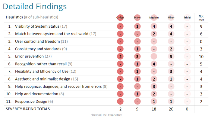
The evaluation identified opportunities for GovGrants to provide their users with a better experience by improving their ability to find information and complete tasks efficiently. The final report showed how GovGrants aligned with usability guidelines and principles and what needed improvement. GovGrants was evaluated against 11 high-level heuristics, which were further broken down into 139 sub-heuristics. Out of the 139 sub-heuristics, 49 (32.3%) heuristics were not met.

For each unmet heuristic, a usability severity rating (from trivial to critical) was indicated and screen captures with annotations were provided along with recommendations. The final report provided the development and configuration teams with clear rationale that supported the ratings and actionable recommendations so they could remove usability obstacles that degraded their users’ experience.
While these usability inspection methods are often performed away from the development team, Flexwind’s UX experts conducted regular check-ins with the developers to see if any of the issues found were known technical bugs, since the system was still in development. In addition to regular status check-ins and an easily digestible final report, the GovGrants team was provided with an educational presentation on usability heuristics and how they are applied to everyday websites. We believe that educating our customers about usability heuristics equips them to better understand the report findings, prioritize the issues uncovered, and have a reference guide for future design challenges.
What Can A Usability Expert Review Do for You?
Flexwind’s UX professionals will conduct a scenario-based, heuristic analysis of your interface and information architecture. We will identify what helps users navigate your application, what is a hindrance, and will provide actionable steps for better meeting your customer goals. We can test websites, applications, mobile apps, wireframes, mockups and even paper sketches.
As outside experts, we deliver unbiased recommendations based on what’s best for your users and your business. Get in touch and let’s work together to ensure your product is easier and more efficient to use, matches your users’ expectations, and provides an enjoyable experience.
About the Author
Andrew Lopresti, UX Evangelist
Andrew joined Flexwind in 2019 after building and leading UX teams at multiple, prominent Federal consultancies. Andrew seeks to understand why smart people sometimes fail and looks to turn those frowns upside down. A frequent speaker at conferences and guest lecturer at local universities, Andrew holds a Bachelor’s degree in Studio Art (from when the internet was young) and has a UX Certification from Human Factors International.
